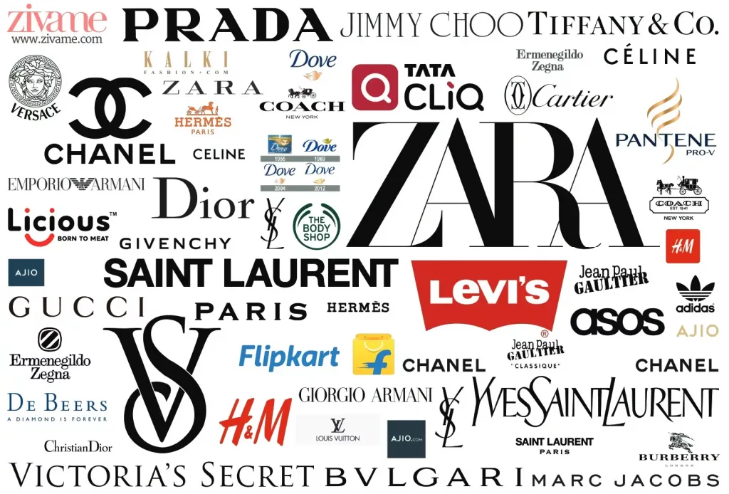
Fonts and branding go hand in hand. Why should you care though? You are just a small business… Well, my friend, you are competing with everyone when you are publishing any type of digital content and to be competitive you need to know how to use fonts to your advantage. I have even included some free custom fonts you can download at the end of the post.
Recently, Jaguar’s bold rebrand caught eyes—and criticism—when the automaker switched to a distinctly spaced, mixed-case font for its new logo. Dubbed “JaGUar,” this update was meant to signal exuberant modernism and an electric-future mindset—but many felt it felt jarring, even unsettling. It’s a perfect reminder that fonts and branding aren’t just decoration—they can make or break how people feel about your brand. One wrong typographic move, and your message may get swiped left.
Typography: Your Brand’s Secret Handshake
Fonts do more than dress up words—they whisper your brand’s personality the instant someone lays eyes on you. In today’s scroll-happy social media world, even the smallest business needs a font strategy that’s as sharp as its logo. Here’s why:
1. Instant Personality & Trust
- Serifs (little feet on letters): Evoke tradition, authority and trust—think banks and high-end labels.
- Sans-serifs (clean, no-frills letters): Feel modern, honest and approachable—perfect for tech startups or wellness brands.
- Scripts & Display Fonts: Add flair, creativity or warmth when YOU want to stand out—just don’t overdo it.
2. Cohesion Across Channels
Consistency in font usage (primary + secondary family) makes your website, ads, social posts and packaging look like parts of the same story. That cohesion equals professionalism—and people trust what looks polished.
3. Words That Move: Video & Ads
- First impressions happen fast. A law-firm spot in Comic Sans? Instant eye-roll. Swap in a crisp serif, and you’ve got credibility.
- Emotional cues land quicker than words. Bold sans-serif headlines in a sale ad feel urgent; softer scripts in a charity video tug at heartstrings.
4. Captions That Captivate
Most users watch on mute—so captions aren’t optional, they’re mission-critical. When you pair on-brand, legible fonts with snappy animation:
- Watch time jumps: Captioned videos see double-digit boosts in completion rates.
- Retention spikes: Short bursts of animated text keep eyes glued to the screen.
- Accessibility wins: Clear fonts help everyone follow along, even in noisy or quiet settings.
Fonts and Branding:
Treat your font like a brand ambassador. Select families that echo your values, use them everywhere (yes, even in that TikTok), and give your captions the TLC they deserve. Nail this, and your audience will “read” your brand’s vibe before you even say a word.
Stay In Touch
Download 35 Custom Fonts For Free
For more fonts you can visit DaFont
